Styling by Lucy Gough – assisting project

clocks

table lights

TheSundayTimes_Habitat lamps

I had the amazing opportunity to assist Lucy Gough to one of her photo shoots and I was so looking forward to receiving the images so I can share this with you, guys!  Nevertheless, I had the honour to observe and learn from  Xavier Young the photographer with whom Lucy has collaborated many times. What I love about this industry is that no matter how known you are or your just in the beginning, if you’re the stylist or the painter… you will be treated equally and with respect. It’s all about team work and each opinion matters. Because everybody knows that each has an important role in making an image look amazing. Therefore, Lucy, Xavier and the entire team managed to  come up with this stunning images which I’m so happy to post. There were 2 fun days in which I learned and meet wonderful people, and that makes everything worth it.

House of Gray – location discovery – photo shooting assistant

3

Hello, Monday! Let’s start this week with a beautiful post and a lot of inspiration. How was your last week? I had a pretty good one. Three days in the studios, new interesting projects, different challenges and wonderful stylists & set designers to assist. I wanted to share this particular one because you really need to know about this amazing location in London for photo shootings. Hannah Deacon offered me the chance to assist her and she chose this stunning location to shoot her cover for House Beautiful. The house belongs to Louisa Gray – if you are into styling it’s a must to know about this two names in the industry – and it’s called HOUSE of GRAY. If you can imagine this house it’s actually where she lives, works and for photo shootings. It’s just perfect for interior styling projects and I was so lucky to be part of this session. I’m so looking forward to sharing with you the final image from June’s issue of House Beautiful.

515182224

Harlequin inspiration moodboard -hacienda

IMG_0143

There’s no better way of starting the day but enjoying a good coffee and pulling out all the fabrics and catalogues, thinking: hmmm what inspires me and what kind of mood board I will create today?! And this is what I came up with – an invigorating, homely and organic style. It’s so me and it reflects how I feel now on a sunny day in London, dreaming of leaving in a hacienda with a swimming pool and a greenhouse which I can convert into a studio. Probably the desire and need for a seaside holiday is reflected in everything I do and think of. Soon!!

The images were taken from Anthropology and Harlequin catalogue, the fabric from Zimmer+Rohde  and the wallpaper from Nobilis Paris.


Graham&Green inspiration – moodboard 2

IMG_0072

I created this moodboard inspired from  Graham & Green images. Soft palette, amazing textures and sophisticated accents…just perfect. The eye-catcher in this space is the desk lamp which is just stunning and the balanced combination of the old wood, stone, fur and antique metal textures . The secret to use so any textures in one room is to keep them in the same tone..otherwise you risk to create a restless atmosphere.

Hope you like it and get some inspiration out of it.

Ela

Back to nature-2016 new trends in fabrics and wallpaper

Having the chance to go to the Chelsea Design Center Festival gave me the opportunity to discover the new releases and keep up with the new trends. We all know that 2015 was all about geometry….well, this year all the designers “brought to life” their collections playing with animal and floral prints. You might have the feeling you are standing in the middle of a flower field or getting lost in a forest. Sanderson, Morric & Co, Harlequin and Zoffany’s collections are so alive and colorful..I just love them. I have to admit that too many patterns are not for me – not to live in a room with too much going on – but some of the fabrics are  to-die-for. I specially adore the daybed from Sanderson  . Whats your favorite?

Global Interior-Wallpaper* issue – assisting stylist experience

WPR16APR901.pdf

Here I am writing and showing you my last project with Wallpaper*. And when I thought that other projects were pretty intense..this was by far harder than what I’ve experienced before. I really have to mention that, I couldn’t have made it without the help of the photographer assistants and the other interns from the office ..and of course Olly, which I stressed her with thousands of txts and phone calls – thank you all. Although we had one of the biggest studios in London, it seams that we still struggled with space. The entire projects was challenging even from the very beginning. We had only few weeks to get all the products in UK  from: Singapore, Mexico,USA etc. We usually have 1 month but because of the Christmas Holidays we had only few time left. Amy Heffernan ( the stylist ) had to change the strategy during the photo-shooting, because some of the products were still on their way. What was very interesting was that we worked in parallel on 2 or 3 sets. Whiles  the photographer and stylist were busy with one set, we were already busy setting the next two. Juggling through the boxes and giving things to do to 4-5 people, it was fun and .. I have to use again, challenging ( I can’t find a better word really).

All in all… the result it’s stunning! I love the products and colour scheme that Amy chose and the Richard Foster’s lighting and composition skills (www.richardfoster.com).

I have to say that, the 4 months experience to Wallpaper* was worth it and looking back I realise how many things I learn and what a fantastic team was the Interiors. I couldn’t see myself doing something else and I hope I’ll have the chance to collaborate again with them in the close future.

WPR16APR182.pdf

WPR16APR105.pdf

WPR16APR105.pdf

WPR16APR104.pdf

WPR16APR104.pdf

WPR16APR103.pdf

WPR16APR103.pdf

WPR16APR102.pdf

WPR16APR102.pdf

WPR16APR101.pdf

WPR16APR101.pdf

WPR16APR100.pdf

WPR16APR100.pdf

Industrial&Modern kitchen solution

Kitchen moodboard

All the houses I leaved in, and there are few now, they all had a bright kitchen with the working area near the window. Therefore, every time I have to design a new space I think, first of all, if there’s enough light and airy surfaces. I love open shelves which are practical and fun – you can add so much flair to the space by mismatching pottery and kitchen accessories; I love to see herbs in pots; I love the texture of the wood – I couldn’t never see myself working in a kitchen where there’s no wood whatsoever ( although I like it to be in small amounts) …and I definitely love tiles.

This moodboard was made for a potential kitchen of a client – unfortunately the new property came with a kitchen already, so we couldn’t go with this projects, although he was so thrilled of the project. From the beginning he wanted something industrial but cosy with black cabinets and white tiles. Because the kitchen was near to a water canal, I wanted to add accents of natural textures and linen fabrics so it will feel a bit summery – taking in consideration the grim London weather.

I had to leave the space as simple as possible so it will stick to the budget, but if I have to play a bit more with my imagination I could add  just a bit of colour to the scheme and some graphic accents: some Moroccan tiles or illustrations on the wall , some playful Mexican or Asian plates and mugs… and i will have to stop now otherwise I’ll risk having a creating atmosphere.

Hope you like the project and find it inspiring for your own kitchen.

Have a sunny day.

Ela

Styling moodboards – textures and surfaces

I was trying to find some images in my folders, when I came across this moodboards I put together in my first month at Wallpaper* . I remember how excited I was when I opened the cupboards where the Interiors Department kept all the samples. I was like a child on X-mas day. But let me tell you something: when you have so many to choose from it can be so overwhelming, that you hardly can concentrate on remembering what you had in mind to do in the first place. I started by mixing lots of textures, fabrics and basically everything that I liked the most – the result was obviously the first image… and then I tried to narrow the selection and keep only those that could be a perfect fit for a interior project of a cafe or store. I had to come to the office very early in the morning and work on one of the conference desks which was close to a big window so I can have enough light. With the timing and conditions, I’m very pleased of the result.

Hope you like them.

Ela

Heal’s collection – Furniture and home accessories

I do not know if you heard about Heal’s, but if you haven’t, it’s time for you to visit their website (www.heals.com) , especially if you are in the UK. To be honest, I recently discovered them and I’m so glad I did as they are amazing. The products and especially their styling it’s what I call: good quality stuff!!  I’m very inspired when browsing through their gallery and although I won’t be able to have a photo shoot of this caliber, I will be pleased to reduce it to a smaller scale. What I like the most is that all the designs are so elaborated, simple, but very trendy and it creates such a calm atmosphere. I wold love to have at least one their items in my house. So, it’s a must-have-item which is already on my list to buy when I will have my own house.

brunelstool-lifestyle_2 cumuluscorner-leftlifestyle580 dodie1

fawn-living-lifestyle_1

industrialblock1 industrialblock2 spuncopper

Hope you have enjoy it and good luck with your work, even if its not something that creative.

Till next time, take care!

Ela

British handmade designers I met

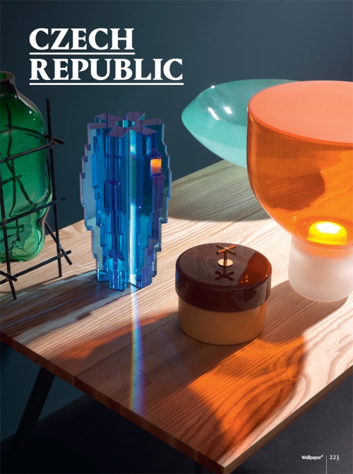
Saturday it’s market day. A day where you find pleasure in discovering new designs and unique jewellery peaces…and ending the day with a great wine and tasty burrito. Anyway, this post it’s not about the markets, it’s more about handmade artists and their displays. Last Saturday, on a sunny and hot day, I went to Spitalfields Market where I came across few super interesting booths and I was so glad that the girls were very nice and allowed me to take few pics.  As you noticed, they all look different and they are so unique in their own way.  I invite you to pay them a visit not just on their website but at the market and chat with them. They are so nice and they will tell you so many things about their little peaces of art.

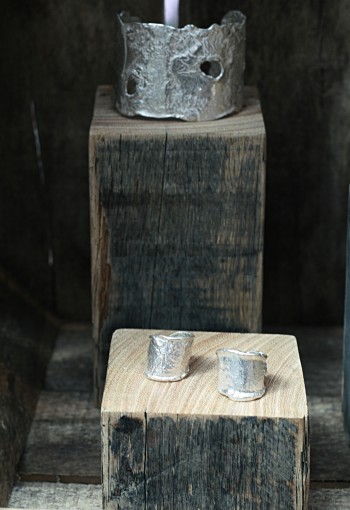
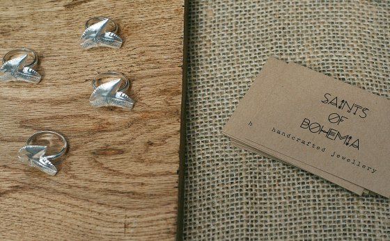
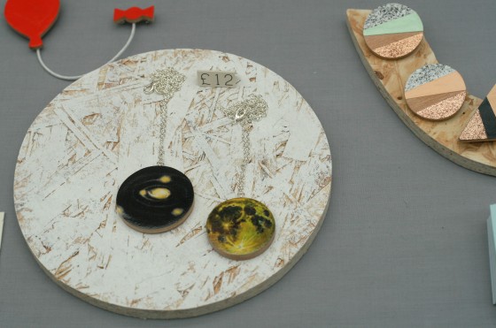
So, meet SAINTS OD BOHEMIA. Their display was clever chosen to match the raw finish of the jewelleries.  The metal and the wood will always go well together and offset each other.  A very well done matching tone and textures. The booth definitely stands out and in fact it was easy to look at each peace, although, they had a quite lots displayed. Well done!

jew1

jew3

jew6

jew8

jew2
jew4

jew5

jew7

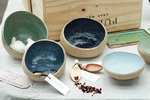
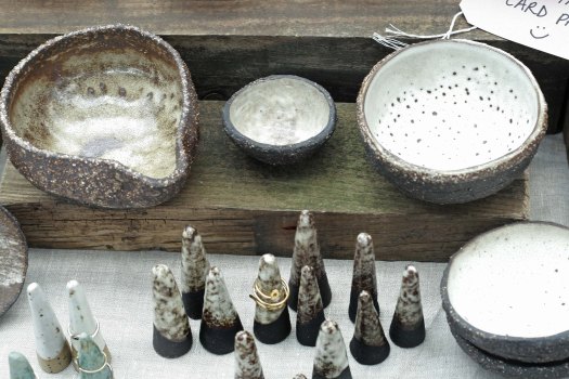
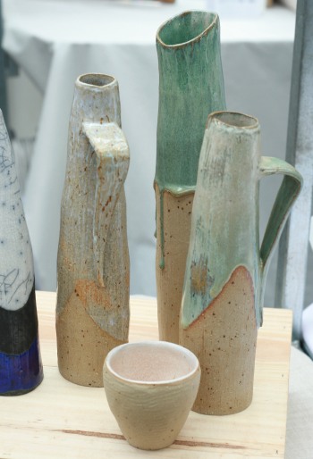
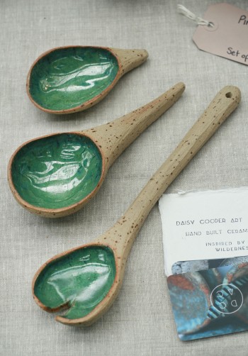
Next, is Daisy Cooper . Her slogan is: Inspired by Wilderness… and you can see that in the full collection of ceramics. I love the colour shades, the textures and the way she arranged them using natural materials. Some of her items can be used as food and jewellery display, as shown above. Her logo and business card is brilliant. Congrats to Daisy!

spitefild1

spitefild2

spitefild3

spitefild5

spitefild4

spitefild8

spitefild6

spitefild7

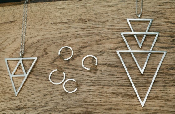
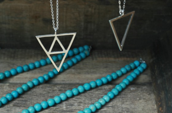
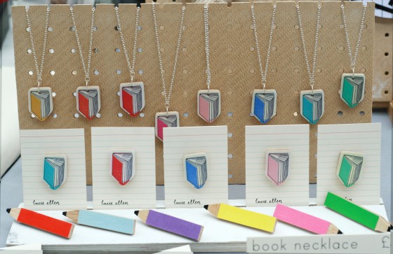
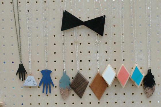
And now let me introduce you to Lucie Ellen for those who love simple geometric shapes in different colours and multiple illustrations. This accessories are full of joy and fun. They have a optimistic vibe and, because of their simplicity, can be combine with lots of types of outfits. If I would have to wear them, I would get an asymmetrical gray/back long dress or a simple long shirt. Love them!

spitefild15

spitefild16

spitefild17

spitefild18

spitefild19

spitefild20

spitefild21

spitefild22

spitefild23

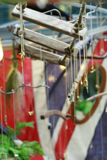
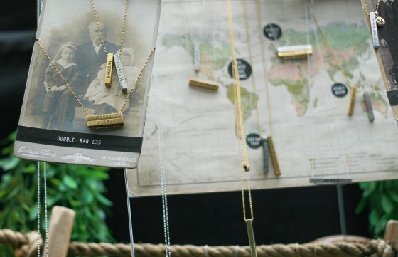
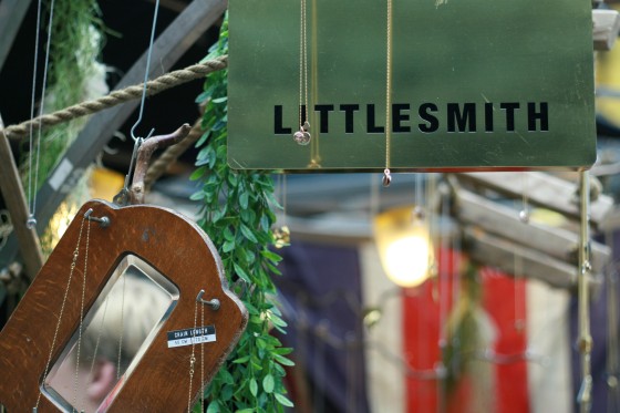
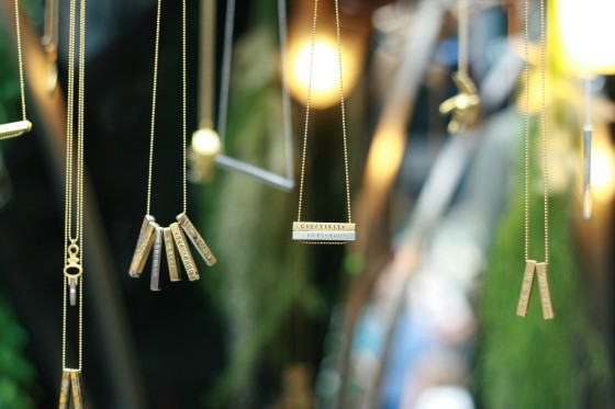
Last one, Little Smith, had the most elaborated booth. Using ropes and fabrics, combined with greenery and vintage items. It looked so natural and crazy ( in a good way). Each corner was well arranged and the entire design highlighted the uniqueness of each item. You should definitely check their website – its brilliant. He is super talented and  they do care a lot for their image. It’s worth pay them a visit.

spitefild24

spitefild28

spitefild25
spitefild26

spitefild27

Hope I aroused your interest in visiting the Spitalfield Market and if you will see one of this beautiful artists, please say hello and try to interact with them.

Have a lovely Monday !

Ella